SALT & LIME
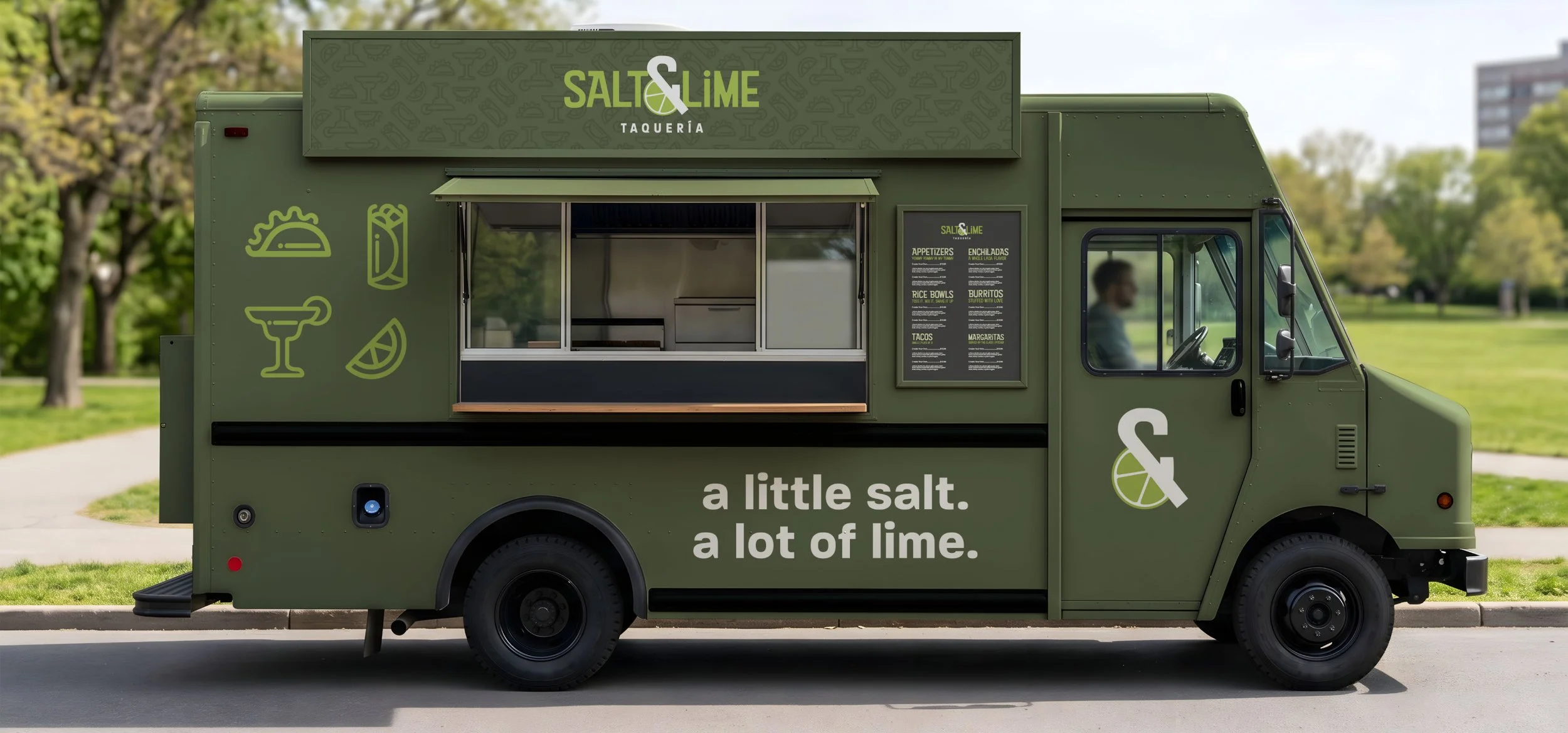
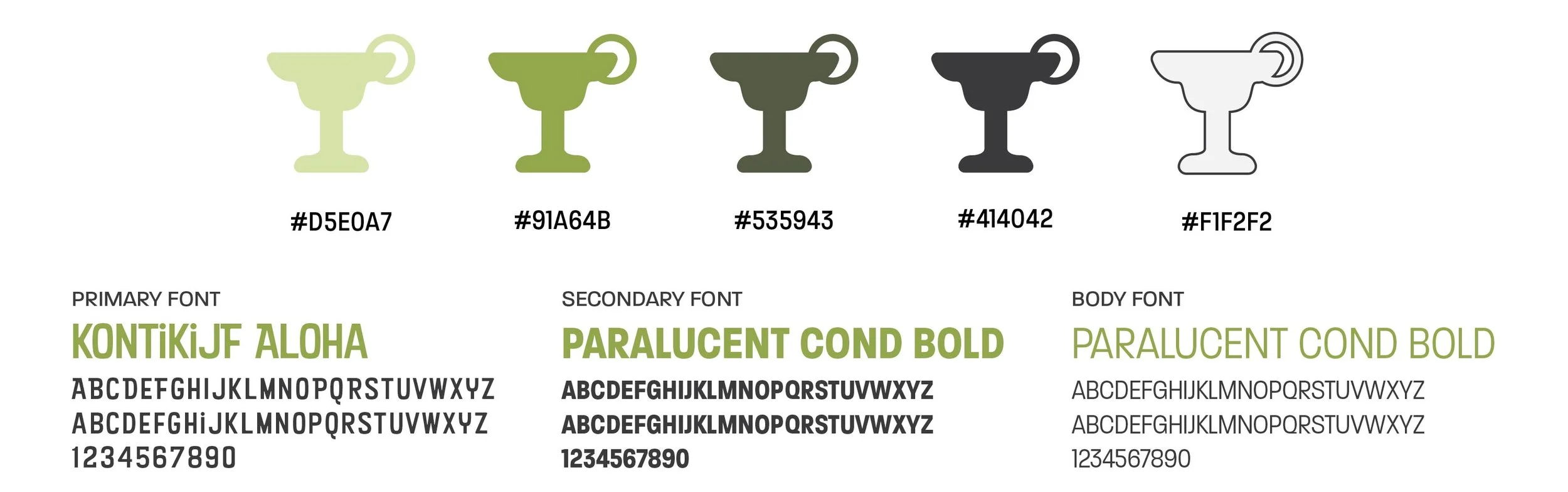
Salt & Lime is a modern taqueria concept built around bold Mexican-inspired flavors, bright citrus, and an easygoing atmosphere. The identity pairs a deep olive palette with punchy typography and playful illustrations to create a brand that feels equally at home over tacos and margaritas.
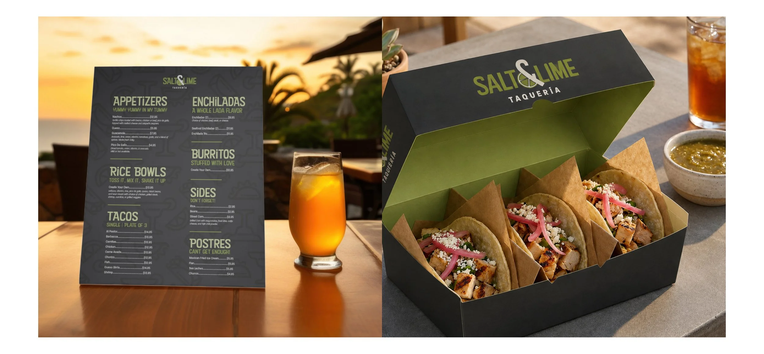
Designed as a self-initiated concept, the project explores a complete restaurant identity across packaging, menus, signage, merchandise, and environmental touchpoints.
BRAND IDENTITY • PACKAGING • CAMPAIGN
FAMILIAR, WITH A FRESH SQUEEZE
Salt & Lime reimagines familiar taqueria cues through a more modern visual language. Bold typography, simplified illustrations, and a produce-inspired palette create an identity that feels playful and approachable without relying on the expected visual tropes of a traditional Mexican restaurant.
A LITTLE SALT. A LOT OF LIME.
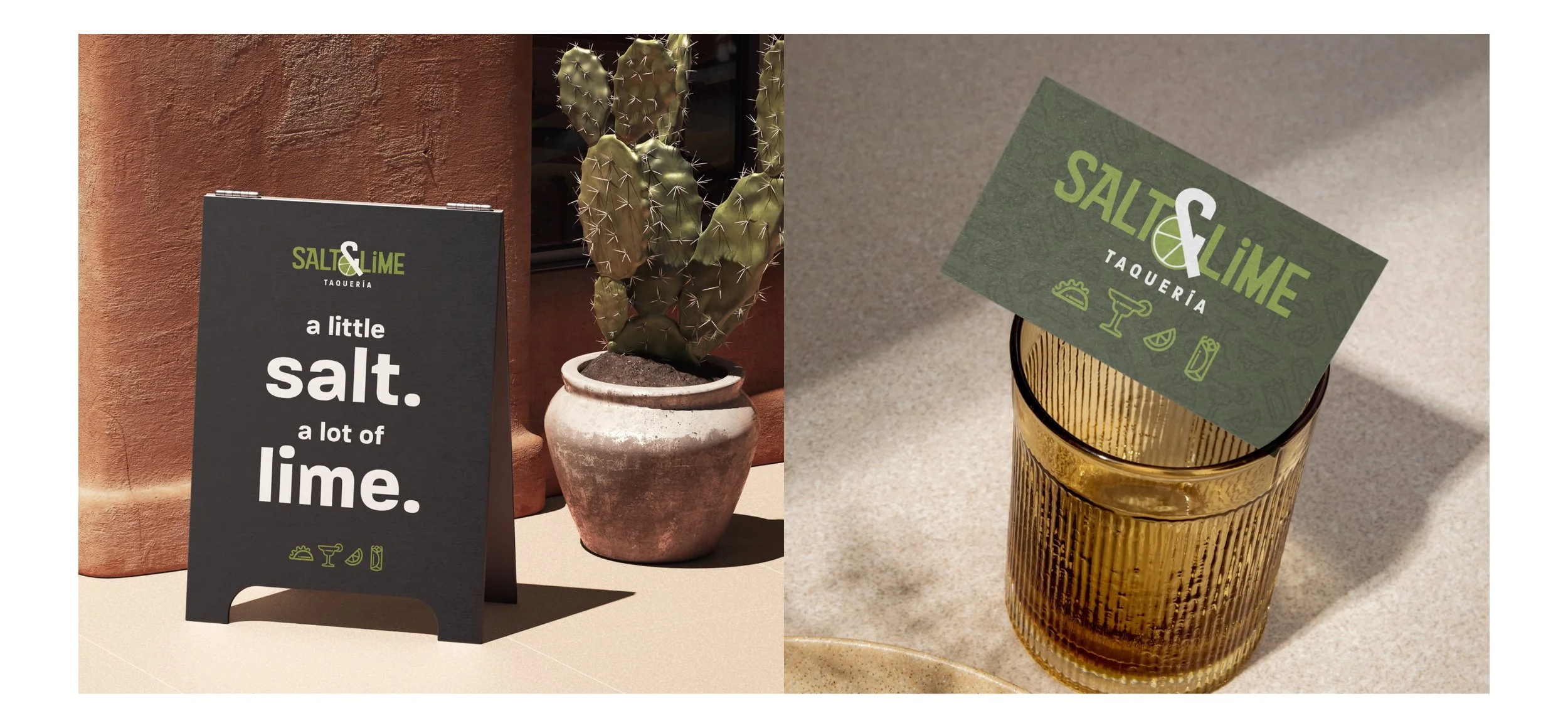
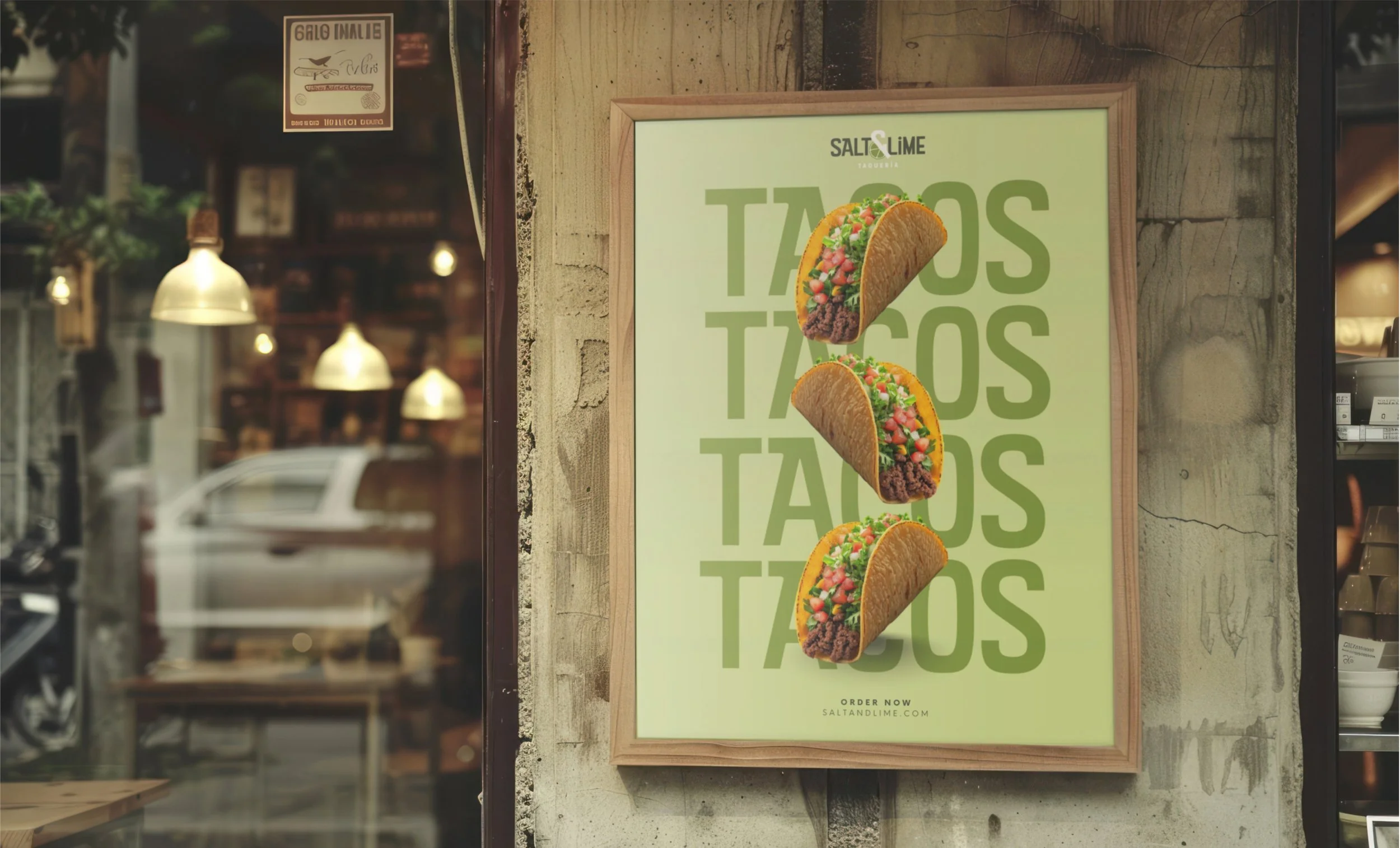
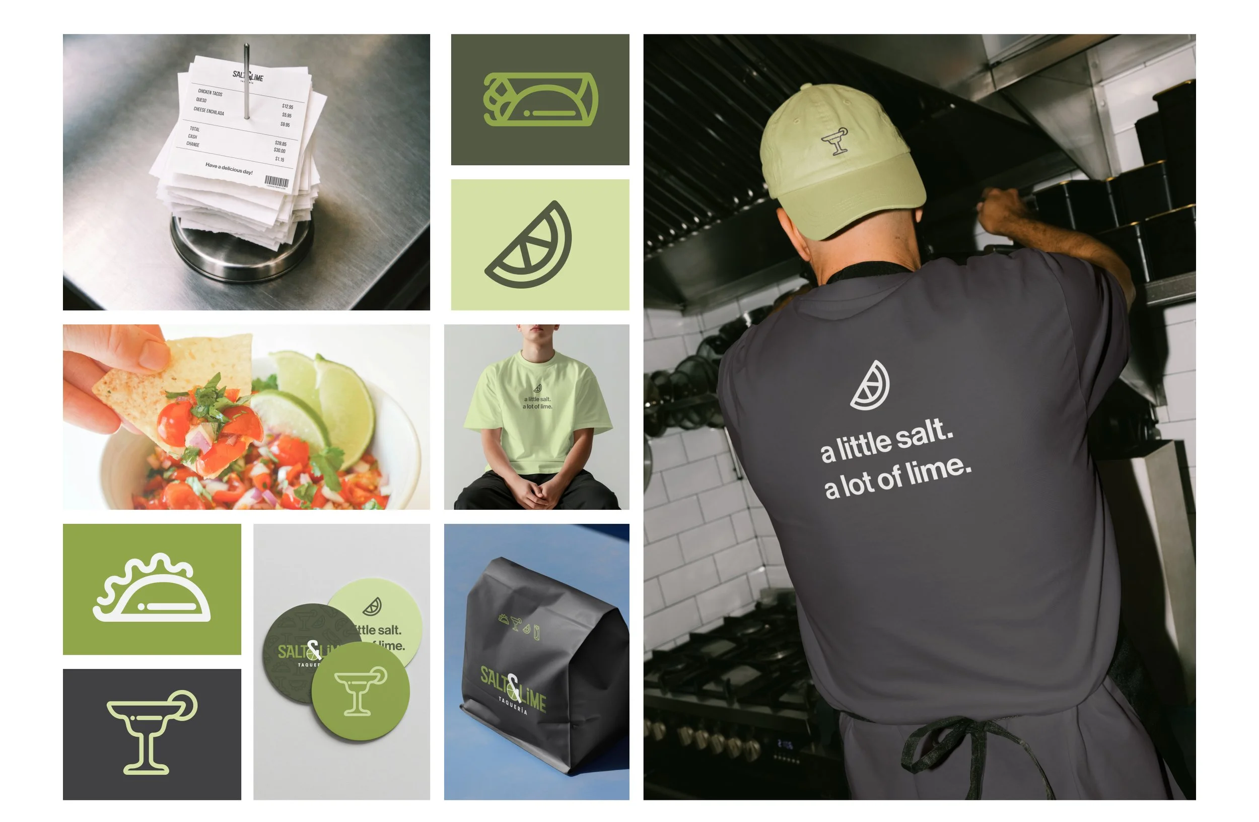
The brand voice is simple, playful, and direct: using bold messaging and graphic repetition to create memorable moments across signage, packaging, and the physical restaurant experience.
MADE TO GO
From menus and takeout packaging to uniforms and everyday restaurant details, the identity was designed as a flexible system that stays recognizable across every customer touchpoint.
Self-initiated concept.