SECONDS
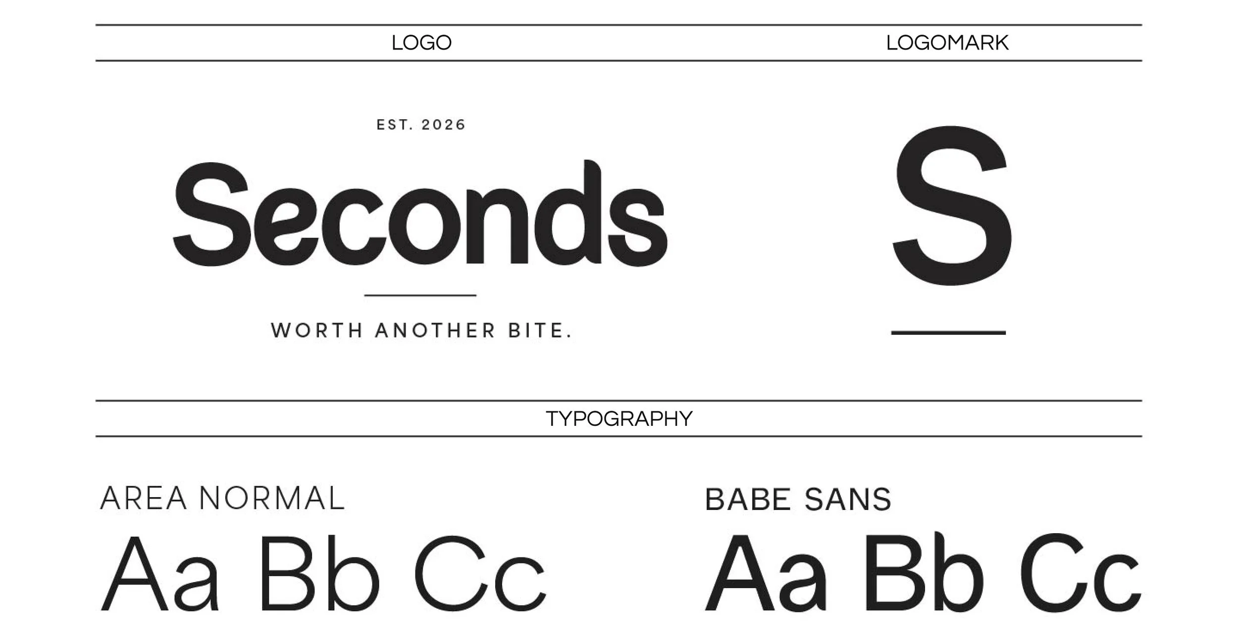
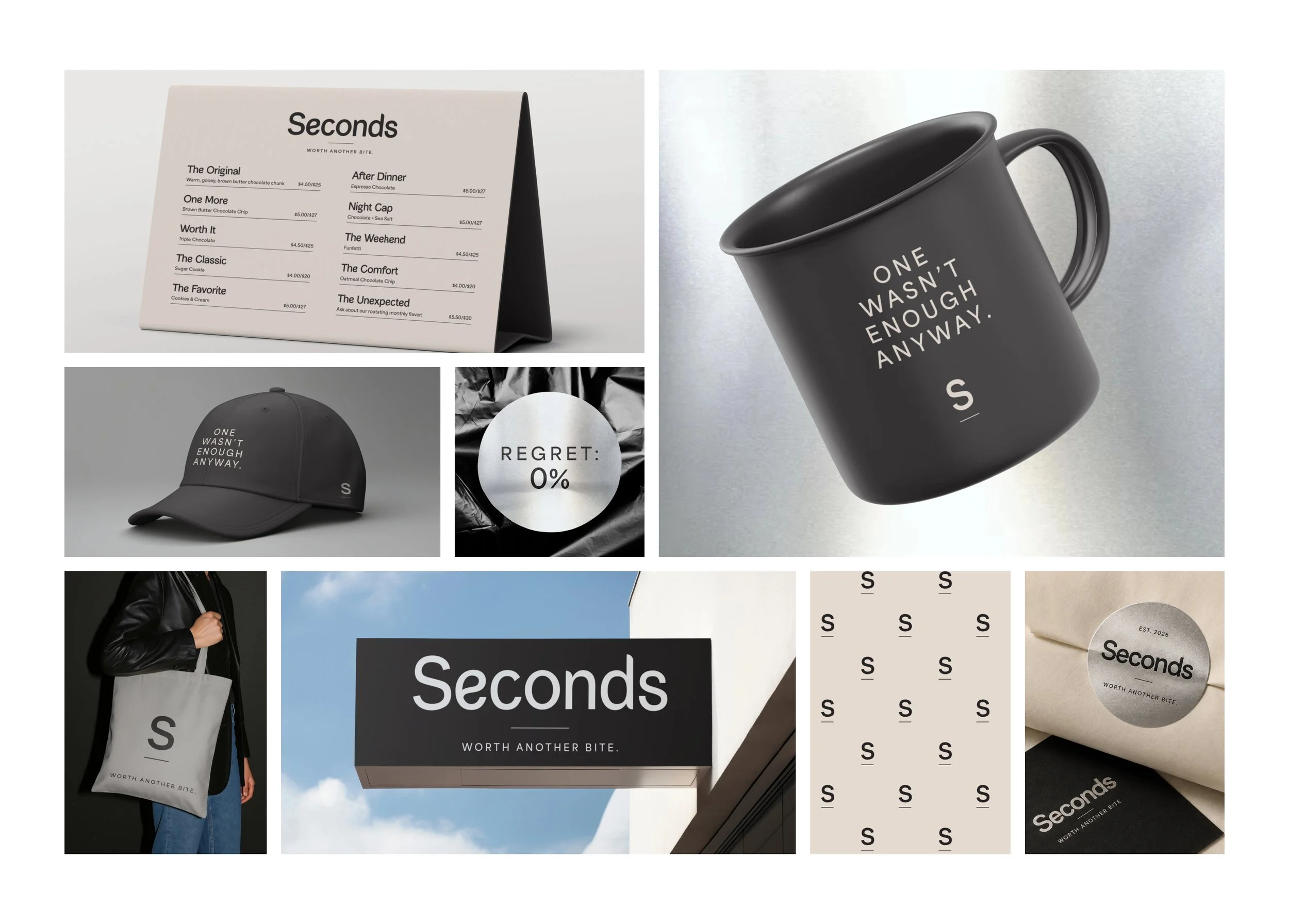
Seconds is a conceptual small-batch bakery created to challenge the visual language of traditional home bakeries. Rather than leaning into the expected rustic, whimsical, or overly feminine aesthetic, the identity combines clean typography, warm neutrals, and unexpected metallic accents to create something modern, confident, and inviting.
The brand is built around the idea of "having seconds"—a familiar phrase that becomes the foundation for the brand's voice, product naming, packaging, and customer experience.
BRAND IDENTITY • PACKAGING • ART DIRECTION
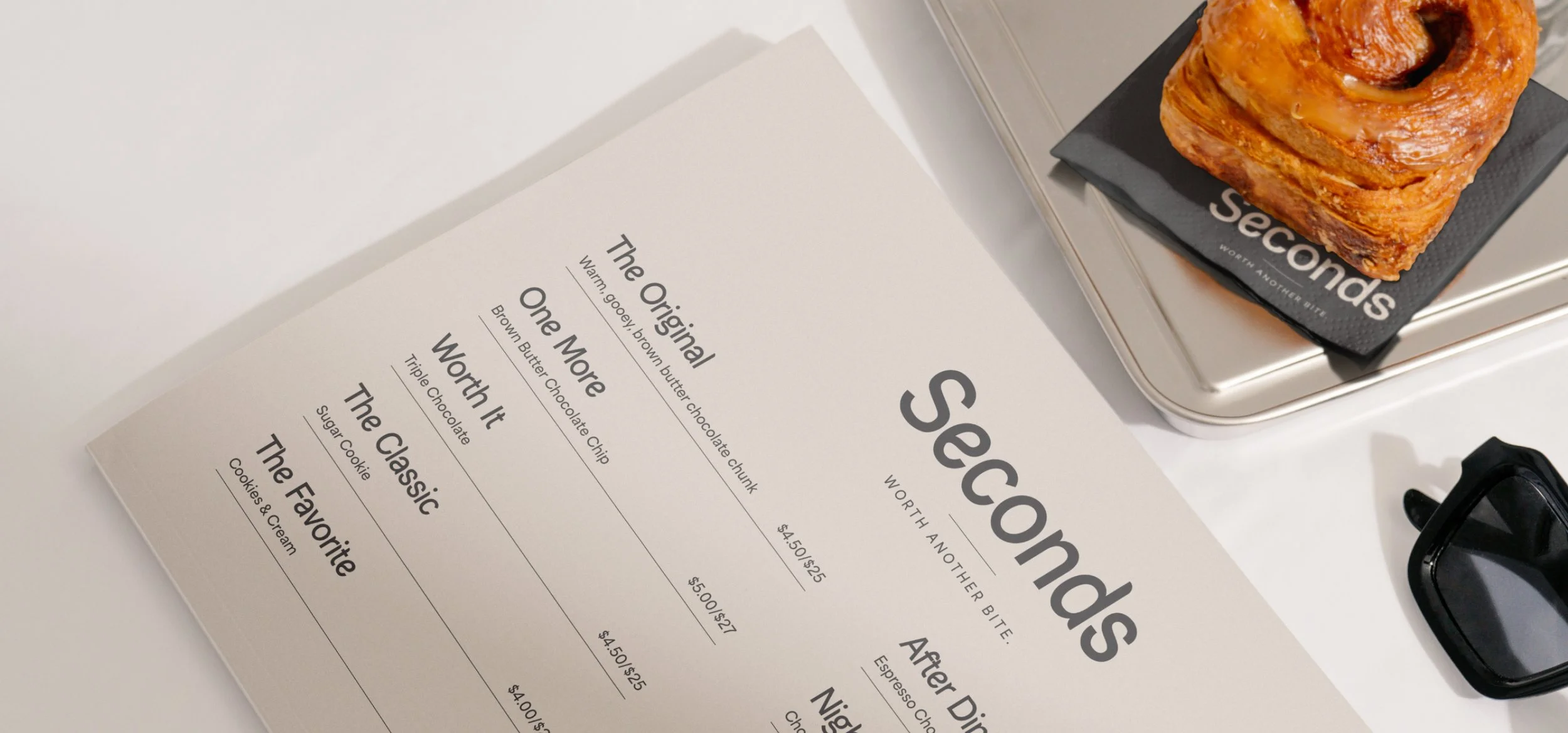
A REFINED IDENTITY BUILT AROUND THE IDEA OF THE IMPERFECT BITE.
The name came from a familiar moment: finishing something you love and immediately wanting another. "Seconds" transforms that everyday phrase into a brand promise—baked goods worth coming back for.

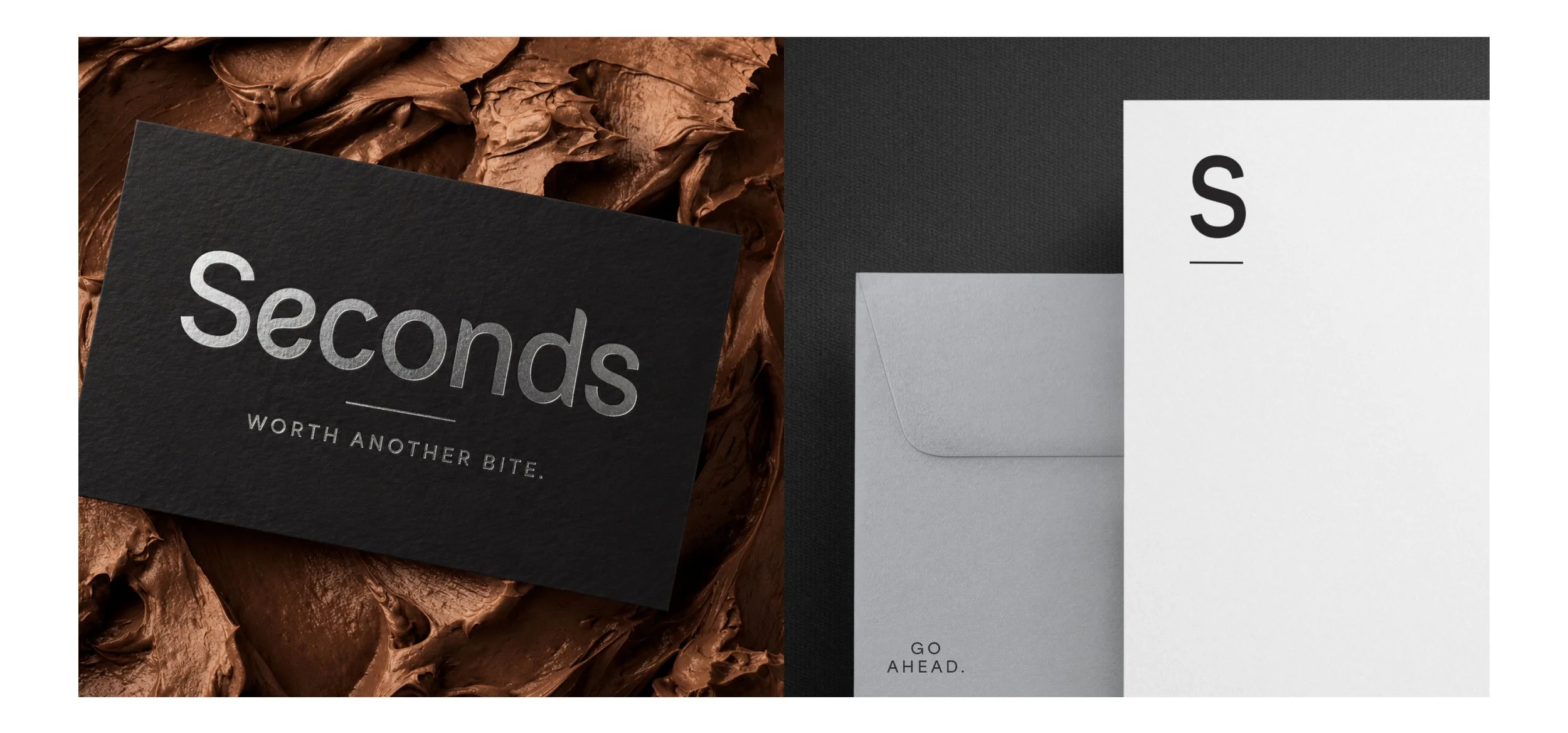
THE BRAND, IN HAND
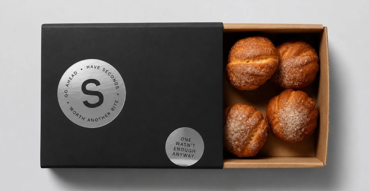
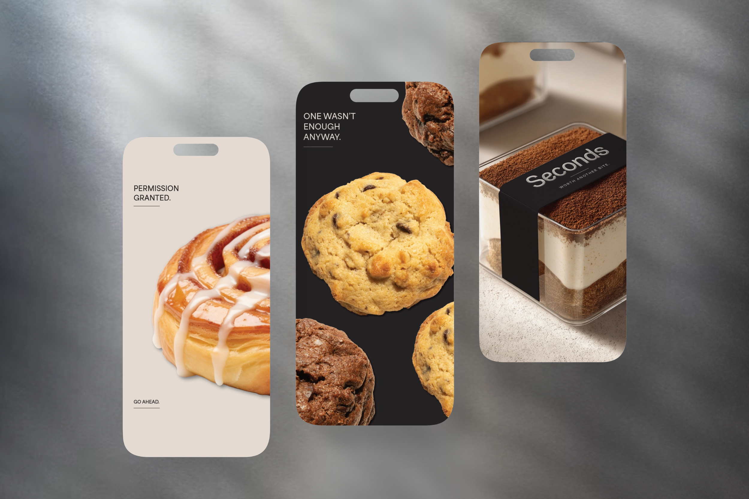
Packaging brings the identity into the physical experience, balancing a restrained palette with tactile, playful details.
Seconds is a self-initiated concept.